Upgrade Your Outdated Website: Make your website work to achieve your buisness goals with a Website Redesign
Creating and maintaining an aesthetically pleasing and user-friendly website is essential for effectively reaching and engaging with your target audience. It’s recommended to refresh your website design every five years or less to keep it up to date and relevant. In this article, we’ll explore some successful examples of large-scale website redesigns that have resulted in higher conversion rates, helping businesses effectively market and sell their products and services.
Green Sun:
Before

After

ZipLocal’s website redesign focused on improving aesthetics, functionality, search engine visibility, and user experience. Clear calls-to-action and optimized landing pages aimed to increase conversions, while a modern, responsive design made the site visually appealing and easy to navigate. Finally, a user-friendly navigation structure was created to make it easier for users to find what they are looking for on the website. These changes allowed ZipLocal to provide a better user experience, increase traffic and potential customers, and ultimately improve conversion rates.
DC Garage doors:
Before

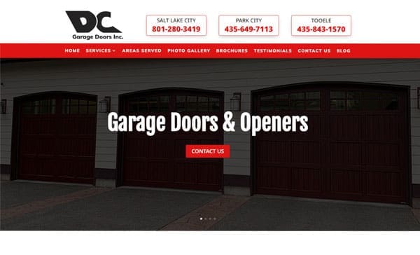
ZipLocal’s website redesign was not only aimed at improving the overall look and feel of the website but also focused on conversion optimization. This involved incorporating clear calls-to-action (CTAs) throughout the website and optimizing their landing pages. By doing this, ZipLocal aimed to increase the likelihood that visitors to the website would take a specific action, such as filling out a contact form, making a purchase, or subscribing to a newsletter.
Overall, by focusing on conversion optimization, ZipLocal was able to not only improve the aesthetics and functionality of their website but also increase the chances of turning website visitors into leads or customers.
Ebay:
Before

After

The redesign included an updated homepage, which featured personalized recommendations for users based on their browsing history and interests. The new homepage also included a more prominent search bar, making it easier for users to find what they were looking for.
In addition to these updates, eBay has also made a number of smaller changes over the years, such as improving the checkout process, adding new payment options, and enhancing the mobile experience. These updates have helped to keep eBay’s website up-to-date and competitive in the ever-changing world of online commerce.
Google:
Before

After

A significant update to Google’s website came with the launch of its Knowledge Graph feature. This provided users with more detailed information on search results, including related topics and key facts. The Knowledge Graph has since become a core feature of Google’s search experience, helping users to find the information they need more quickly and easily.
In recent years, Google has continued to make smaller updates to its website, such as improving the mobile experience and adding new features like Google Assistant. These updates have helped to keep Google’s website fresh and relevant, and have ensured that the company remains a leader in the search engine market.
McLean Cleaners
Before

After

We redesigned the laundry company’s website by analyzing the current design and identifying areas for improvement. We updated the color scheme to include bright, fresh colors and improved the typography to create a modern, user-friendly aesthetic. The goal was to better reflect the company’s brand and services while improving the user experience.
A website redesign can have a significant impact on your business’s online presence and performance. At Ziplocal, we’ve helped numerous clients achieve their business goals through effective website redesigns. We understand that every business is unique and requires a customized approach to website redesign. Contact us today to learn more about how we can help improve your website’s performance.


